

Update: Version 0.2 beta has been released with some new features and improvements:
- Gap Analysis
- Persona Mapping
- Legacy Auth Detection (UI improvements)
- Authentication Flows
- Report-Only Insights
The Problem
I think I’ve been waiting on something like this since 2017. Back then, we started mapping Conditional Access policies in Excel sheets – drawing paths from left to right, with each column representing a condition or gate to pass, finally mapping out which scenarios were Approved and which should be blocked. It worked, sort of. But it was manual, it went stale the moment it was written, and it scaled horribly. It also didn’t help that you were trying to juggle ADFS claims at the same time, and trying to convert them while being robust could become challenging.
Fast forward to today, and Microsoft’s What If tool is better than Excel – but not by as much as you’d think. You pick a user, pick an app, click Evaluate, and get a flat, scrollable list that tells you which policies applied and which didn’t.
In these lists I find it a bit hard to tell why the policy applied. It tells you why a policy *didn’t* apply, but the lists are on different tabs, so the complete picture is hard to see.
Which condition was the knockout? Was it the platform? The location? The user not being in the right group? You click into each policy, mentally cross-reference the conditions with your scenario, and try to hold it all in your head. For 5 policies, that’s fine – or doable at least. For 30? Well not for me …
The Architecture First
This isn’t the first time I’ve tried building something like this. A while back I prototyped a CA visualizer using React – just modeling policies directly in components and state. It got up and running quickly, sure, but it didn’t scale. The evaluation logic was tangled up with the UI, edge cases kept slipping through, and changing one thing broke three others. It became error-prone fast.
So this time, before writing a single line of code, I sat down with Claude Code (Max running in VS Code) and we designed the entire system together.
First thing is that Microsoft’s Conditional Access policies from the Graph API are structured JSON with a strict, well-defined schema. That maps almost perfectly to TypeScript interfaces in strict mode. Every field, every enum, every nested object – full type safety, and the compiler catches mistakes before they become bugs. It’s almost like CA policies are made for this.
The second thing is separating the evaluation engine completely from the UI. It has to be completely and 100% true to Microsoft’s engine – even if it itself has “quirks” (I don’t know of any particular ones, I’m just saying they should be 1:1 ideally) The engine is pure TypeScript – no React, no browser dependencies, no side effects. Policies go in, results come out. It could run in a terminal if it had to. That separation is what the prototype lacked, and it’s what makes this version work.
Built into the engine from day one is full state tracing. Every condition in every policy produces a trace entry explaining why it matched or didn’t. Not just “Users: matched” – but “User is a member of group ‘All Employees’ which is in the include list” or “Platform condition not configured – matches all platforms by default.”
This was non-negotiable. The whole point of the tool is answering why. If the engine can’t explain its own decisions, it’s just another black box.
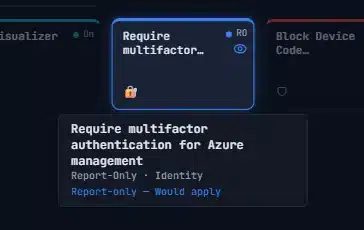
For example – this Report Only policy is highlighted because it would have applied if was turned on for this specific scenario – a Standard User logging into one of the Microsoft Admin Portals.

For state management we went with Zustand, which turned out to be an ideal fit. The app has clearly separated concerns – policies, scenario context, evaluation results, authentication, personas – and Zustand lets you create focused, independent stores for each. State in, results out. Just like the engine itself.
I wrote detailed specification documents – what I call “prompt packets” – for every component before any code was generated. Each packet described exactly what to build, what edge cases to handle, and what tests to write. Claude Code implemented them. I reviewed, tested, and iterated. The architecture was mine. The keystrokes were AI’s.
The rest of the stack is React, Vite, Tailwind, and Shadcn/UI for the interface, with MSAL.js and PKCE for authentication. It runs entirely in your browser – no backend, no data collection, no cookies. Your policies never leave your machine.
The Build Starts
With the architecture locked in, the build could start. I wanted to get an overview, so visuals were going to be important. I wanted some different views instead of just flat lists. I’ve started with three:
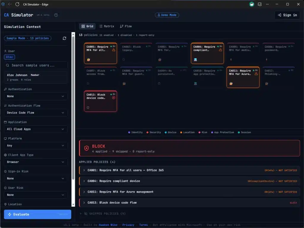
- Grid – every policy as a card, color-coded by evaluation result. Green for applied, red for blocked, amber for controls required, grey for not applicable. The overview you never had.
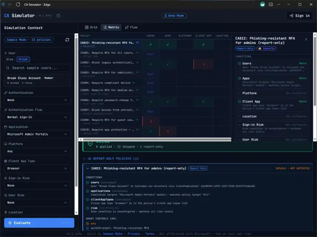
- Matrix – The Diagnostic view, and it’s more than just a list. Every policy on a row, every condition type as a column. Each cell shows whether that condition matched, failed, or wasn’t configured. You can see at a glance that 6 policies all fail at the Users condition because they target admins and you’re testing as a regular user. That pattern is invisible in What If.
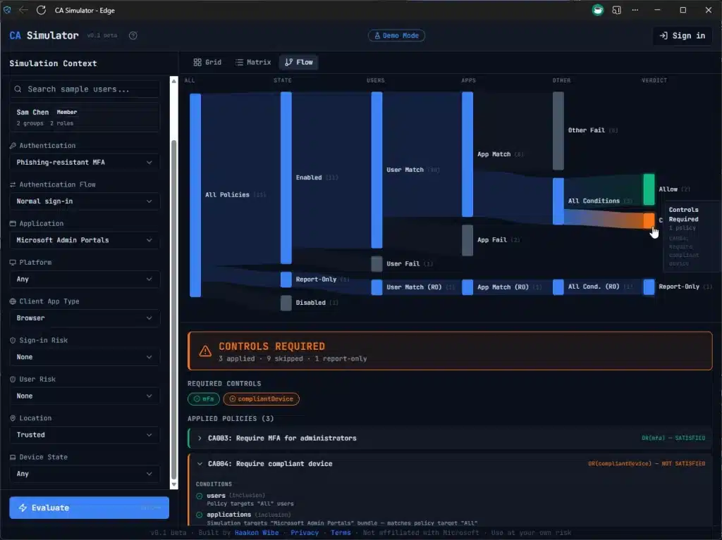
- Sankey Flow – a flow diagram showing how policies funnel from “all policies” through condition evaluation down to a final verdict. The executive summary in one glance. Also shows clearly why you have to satisfy two controls (e.g. both MFA *and* Compliant Device)
The AI Part
I won’t pretend I hand-wrote every line of TypeScript. If you’ve read my Intune Explorer post, you know the workflow – I describe what I want, AI implements it, I review and test. The difference with this project is that I was a lot more deliberate about the architecture upfront. I wrote detailed specification documents for every component before any code was generated.
The domain knowledge – understanding how CA evaluation actually works, what the edge cases are, why role template IDs matter instead of role object IDs, how the Office 365 app bundle expands – that all came from years of working with this stuff. AI didn’t know that includeUsers: ['GuestsOrExternalUsers'] is a special flag and not a group. I did, and you probably know too, because we’ve been burned before.
I think that’s the pattern. AI is incredibly good at writing the code. But knowing what to build, and more importantly what to test for, still comes from the domain.
Try It
Sample mode works instantly with built-in demo data – no sign-in needed. Or connect to your own tenant (or dev tenant) – everything runs in your browser. Sign in and load your policies.
It’s v0.1 beta, so expect some rough edges. Feedback is very welcome – find me on X.